
Blog
My Art, My Perspective
Categories
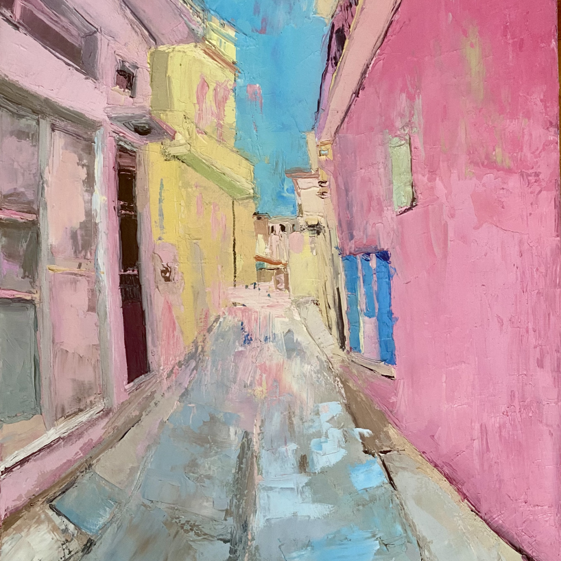
My musings on pink
Pink Musings
I have always loved pink. In fact, I love it so much that I use it as an underpainting in all my paintings. I start with a layer of pink, as I find it makes a big difference, bringing warmth into the painting from the very beginning and seeming to give the colours that are added next more oomph. I suppose that is one of the things I love about colour. It doesn't have to shout to make itself felt. Sometimes I let some of the underpainting come through, as it gives an energy to the finished piece. I'm always looking for buildings / landscapes with a touch of pink. I like the way it changes in different lights and seasons. I'm also intrigued by the colours people choose to paint their buildings and, most importantly, how one colour works against another.
Pink in Skiathos
I was really drawn to this little alleyway in Skiathos, Greece, and found myself wandering along it feeling inspired by the fabulous pink buildings. There was such a range of pinks in that one street — soft, dusty pinks, warmer pinks and brighter shades. I found myself wondering what was around the next corner and, of course, taking photographs as I went and making some rough paint sketches.
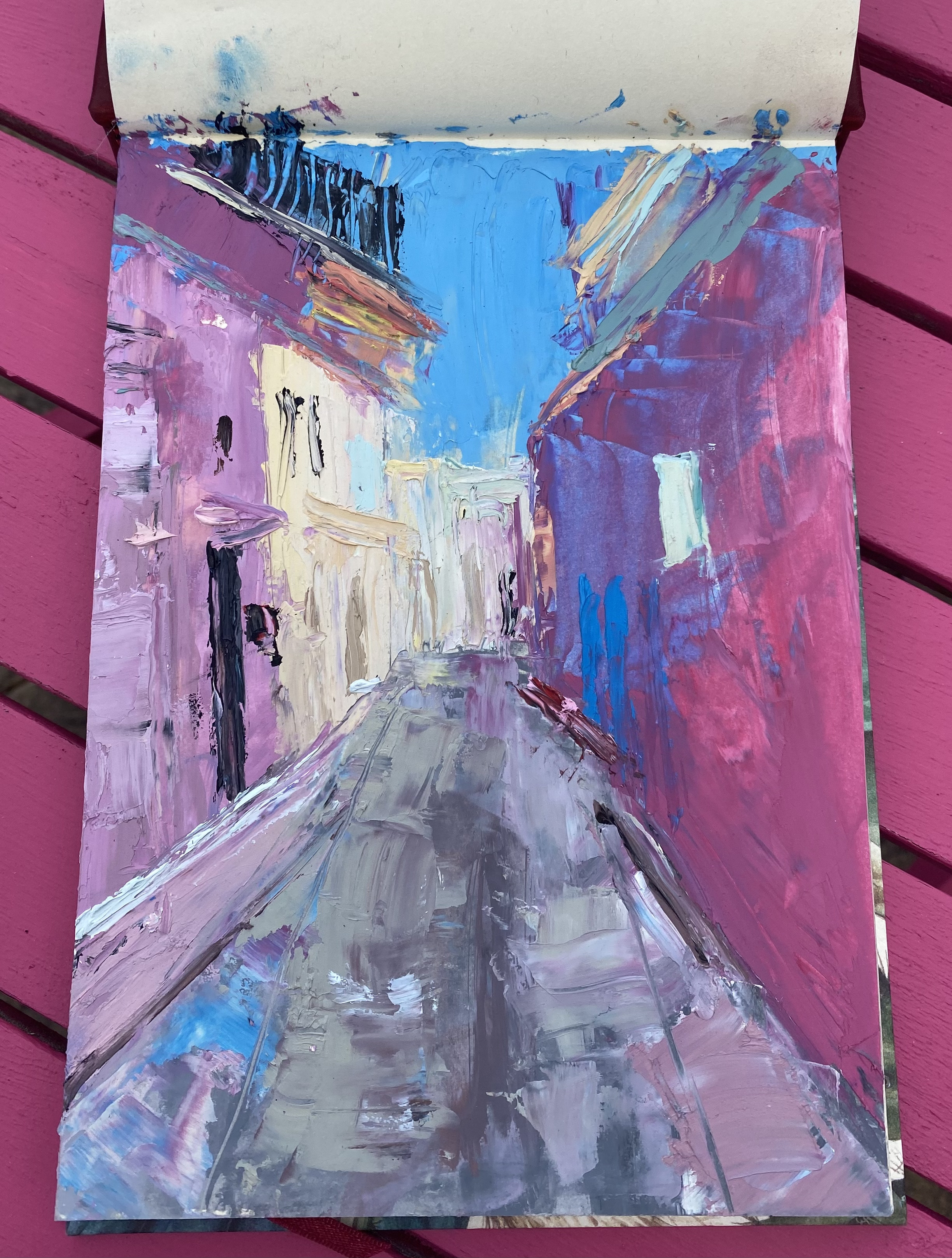
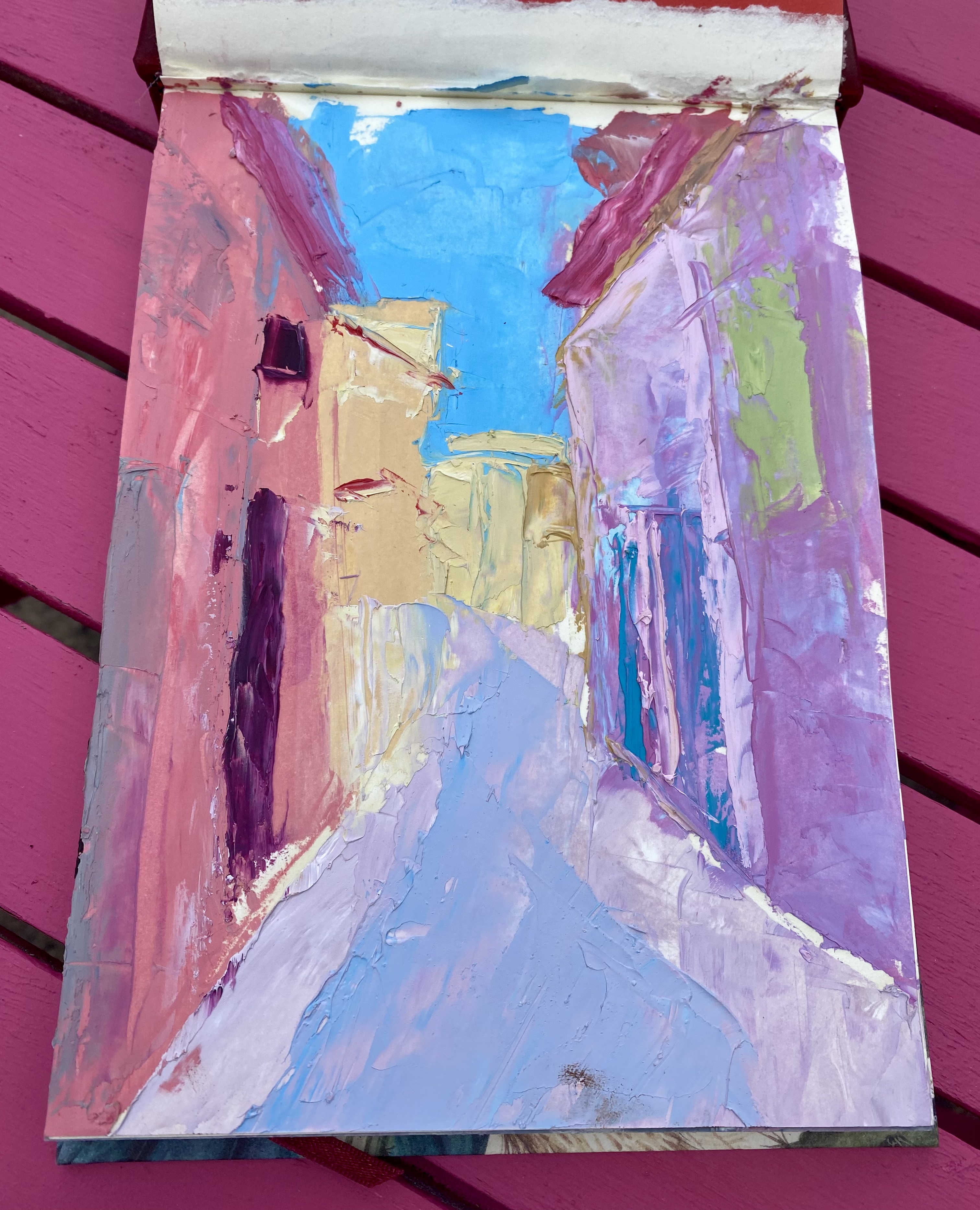
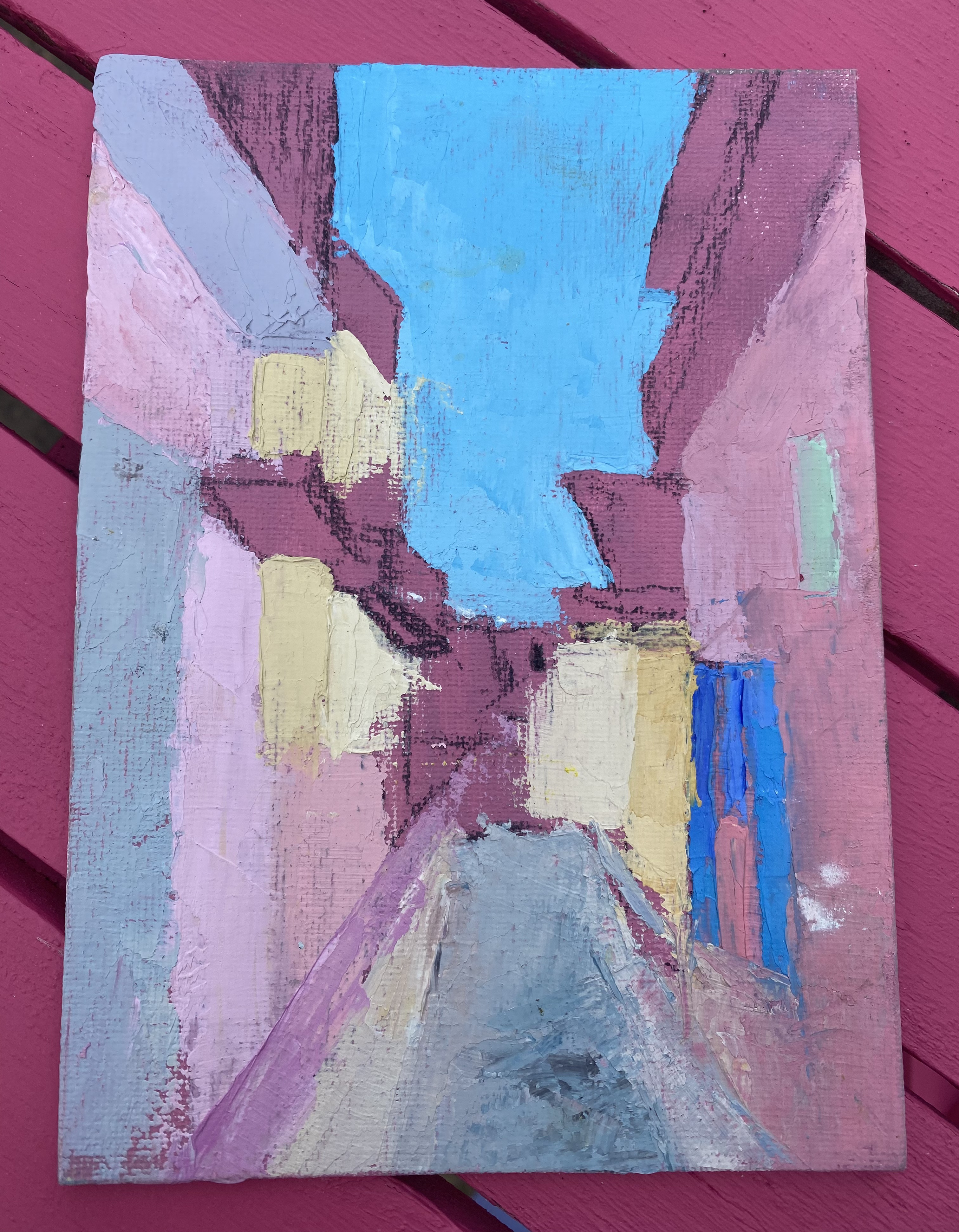
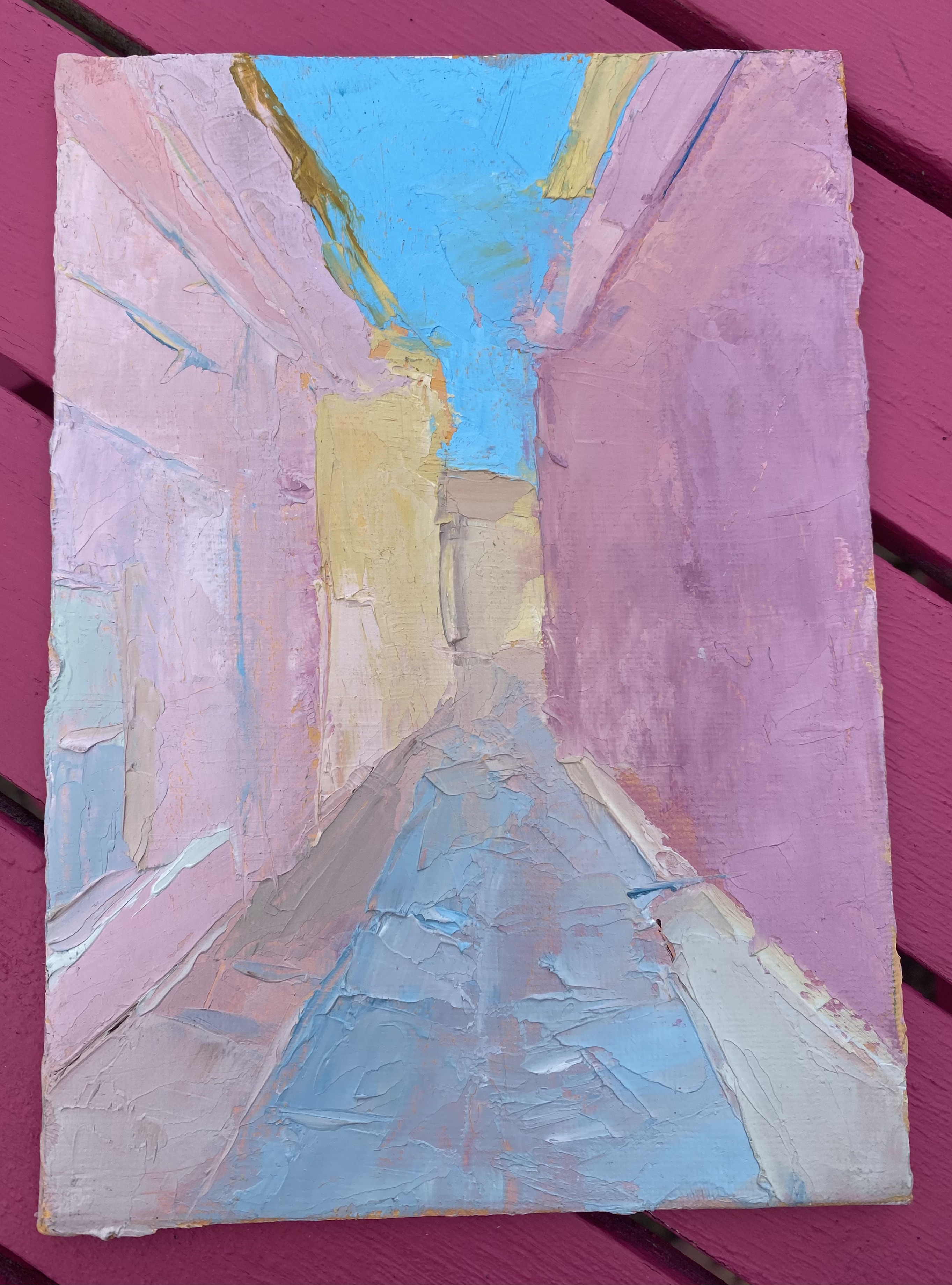
What really caught my eye was the combination of the pink buildings and that brilliant Mediterranean light set against an incredibly intense Greek blue sky. There’s something about all that colour that just makes you happy... as well as that glorious heat!!
And perhaps that is where my fascination with pink really comes from. I don't necessarily think about what a colour means when I see it. I notice how it makes me feel and, more importantly, what happens when you put it beside another colour. My favourite paints to use are Cass Art paints, and I tend to keep my palette fairly simple. For my pinks, I usually start with white and then add various amounts of lemon yellow, yellow ochre and vermilion red till I get the exact pink I want. If it's too warm I use the tiniest touch of cobalt blue or ultramarine to give it a cooler hue. I love mixing my own colours because there are just so many pinks. I don't really think of pink as one colour at all. There are warm pinks, cool pinks, dusty pinks, peachy pinks, blush pinks, almost-lilac pinks... and probably about another hundred I haven't thought of yet. I also love the fact that the pink underneath the painting is already doing its job before I've really got started. So even when the finished painting doesn't look particularly pink, there is usually a touch of pink coming through the layers of paint on top.
When you think about the colour pink, it is a really interesting colour. We tend to think of pink as romantic, feminine, pretty and perhaps a little sweet, but it can also be bold, playful, sophisticated, rebellious and even slightly outrageous. In the eighteenth century, pink was a fashionable colour for both men and women, particularly among the European aristocracy. It was associated with luxury, sophistication and wealth rather than simply being a “girls' colour”. Over time, fashion, advertising and children's clothing helped create the much stronger association between pink and femininity that we recognise today. But perhaps the interesting thing is that artists have never really been obliged to follow those rules. Hot pink, magenta and shocking pink can be anything but delicate. They can be loud, energetic and completely unapologetic, adding a loud statement to a painting.
Pink in other cultures
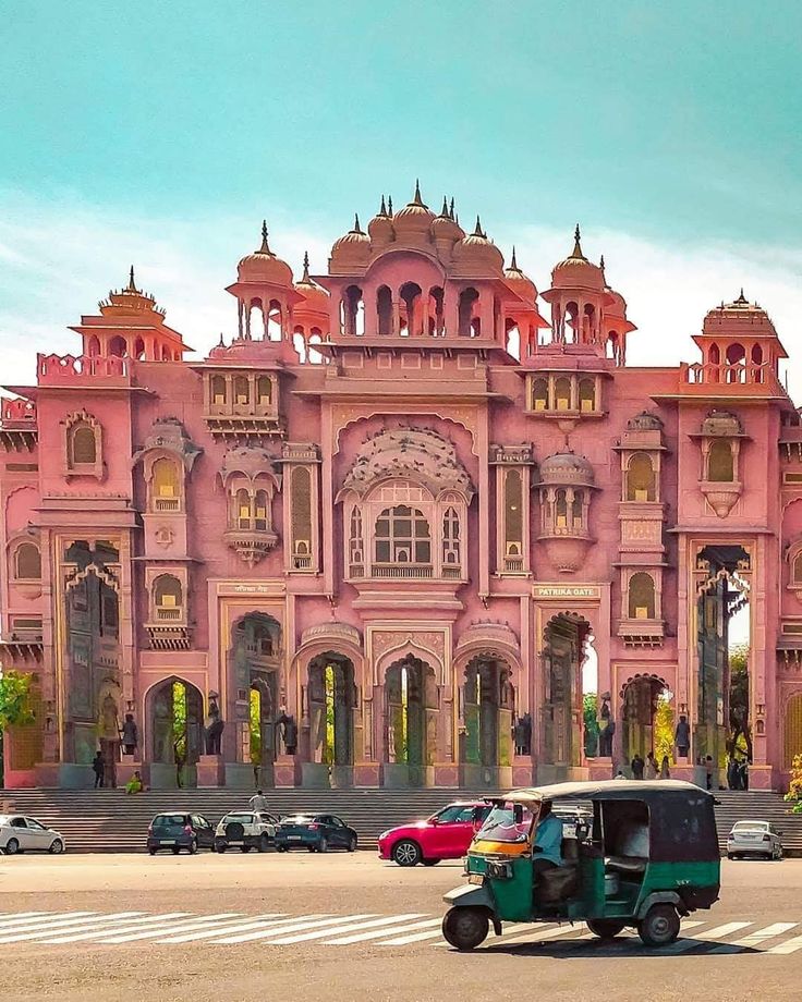
One of the things I find particularly interesting when travelling is that colours don't necessarily carry the same meaning everywhere. In Japan, for example, pink is very closely associated with spring and the cherry blossom. The soft pink of the sakura brings ideas of beauty, renewal and the fleeting nature of life. It is quite a different emotional association from the Western idea of pink being primarily romantic or feminine. Then there is India, where pink has a wonderful cultural presence. It can suggest warmth, hospitality and celebration. Jaipur, famously known as the Pink City, is perhaps the most spectacular example. The city was painted pink in 1877 to welcome the Prince of Wales, later King Edward VII, with the colour becoming associated with hospitality. I love little details like this because they remind me that colour isn't simply about what we see — it is also about what we have been taught to see. Our experiences, memories, cultures and surroundings all influence the way we respond to colour.
 (12).png)
When was pink discovered?
Of course, nobody actually invented pink. Humans have been seeing pink for as long as we have had colour vision. But pink isn't a spectral colour in the same way as red, orange, yellow, green or blue. There isn't one particular wavelength of light that is simply “pink”. Instead, our brains perceive pink through combinations of red and other wavelengths of light. What has changed over time is our ability to make pink pigments and, perhaps more importantly, our decision to give this colour its own name and identity. The word “pink” appeared in English in the seventeenth century. Before that, people used words such as rose, blush, carnation or flesh colour to describe various pinkish shades. Artists have been experimenting with pink pigments for thousands of years, using everything from naturally occurring minerals and red ochres to plant-based colours and, eventually, increasingly sophisticated manufactured pigments. The development of synthetic pigments opened up an entirely new world of colour, giving artists access to brighter, stronger and more stable pinks and magentas.
Which brings me right back to my studio. For me, pink isn't really about romance or femininity. It is about warmth, light and the way colours interact. I like the fact that the pink might not be immediately obvious. It can sit underneath everything else, just quietly doing its job, such a fascinating colour with a lot of associations, and I like that every artist gets to give it a new meaning making it such an interesting colour to work with.

